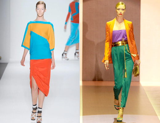
A few guidelines that I like to work with:
1. What works best for this style is bold solid pieces. Pastels are too whimsical and if there is a print you usually don't get the same effect.
2. The look is best with three pieces as opposed to just two, showing a real comparison in color. Which of the two pictures above intrigues you more?
3. Try to use colors on opposite sides of the color wheel to add more interest.
Here is another fantastic example courtesy LookBook


No comments:
Post a Comment